Case Study
Red Valley Orchard
How we turned a small Otago orchard into a recognisable summer-gift brand.
LOGO, VISUAL IDENTITY, WEBSITE, EMAIL, SOCIAL

Project Overview
Red Valley Orchard
The orchard needs predictable, early, higher-value pre-orders and stronger brand recognition, especially in the corporate gifting space.
Timeline: 4 weeks
Tools: Illustrator, Photoshop, Indesign, Figma
Role: Designer
Problem to Solve

The harvest window is short.
Cherries ripen once a year, and there is a narrow time to sell before supply spoils or demand moves on.

Sales depend too heavily on last-minute buyers.
Most cherry gifting happens close to Christmas. Without early demand, the orchard carries risk and unpredictability.

Corporate customers aren’t fully aware of the brand.
Many businesses would happily gift premium Otago cherries, but they don’t know Red Valley Orchard exists or how easy the ordering is.

The product is premium, but the brand doesn’t fully signal that yet.
High gifting value needs high perceived quality. Without polished branding, the orchard gets treated like a commodity producer rather than a premium gifting option.
Design Process

Research: Building Empathy
With insights gathered from the interviews and company data, I developed Personas to represent two primary users. These Personas helped in understanding the unique qualities, preferences and behaviours of Red Valley Orchards customers so that we can prioritize goals according to their needs.
Personas


Empathy Maps


Strategy
We will build a clear, trustworthy, premium brand experience that makes pre-ordering cherries feel easy and desirable, especially for businesses.
Visual Identity
We need a visual identity that communicates:
-
premium quality
-
local Otago heritage
-
hand-crafted care
-
reliability and professionalism
A strong brand identity encourages corporate buyers to feel confident ordering at scale. It positions cherries as a “gifting experience,” not a commodity fruit.

Website
The website becomes the core sales engine. It will:
-
showcase the quality through photography and storytelling
-
include a simple ordering system designed for busy executive assistants
-
clearly highlight the benefits, process, and delivery reassurance
-
push early pre-ordering through messaging and CTA structure
-
capture leads outside harvest season through a waitlist/ newsletter

Email campaign
Email is where conversion and repeat love happens. Use email to:
-
announce the season opening
-
promote pre-order urgency (“limited harvest”)
-
reassure with clear timelines and how-to-order guidance
-
follow up with delivery updates and customer service touchpoints
-
nurture off-season loyalty so next year’s orders come earlier
Logo and Visual Identity
With insights gathered from the interviews and company data, I developed Personas to represent two primary users. These Personas helped in understanding the unique qualities, preferences and behaviours of Red Valley Orchards customers so that we can prioritize goals according to their needs.
Typography
-
Rockledge Bold was used for it’s modern sans serif that signals craft and tradition without drifting into “old-timey” territory
-
Overpass is used as the secondary text
Illustration
-
Cherries reference the product being sold.
-
This is an adaptable element as this can easily be swapped out for other products they sell (Apples, watermelon, berries, plums, etc.)
Colour
-
Red references both the company name, location, and fruit. It also hints at Christmas, especially when paired with white text on red background.
Establishment Date
-
This is used to signal longevity, and implies roots and consistency. It adds a premium feel by signalling tradition and a level of craft. It is a subtle trust marker
Tagline
-
It instantly anchors the orchard in place. Otago already carries a reputation for exceptional cherries, so the tagline borrows that credibility and strength. It also raises the emotional value of the product. You are not selling a box of fruit, you are gifting a piece of summer.

Website
Site Map & Wireframes
Site map and Wireframes were crafted to map out user interactions and align the design with both user needs and business goals. This process ensured a smooth, intuitive experience while helping to:
-
Anticipate and remove potential navigation roadblocks
-
Test whether users can complete key tasks efficiently
-
Align the overall flow with business objectives, driving engagement and conversions

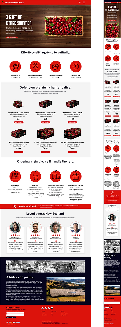
Website Design
Below are the home page for the desktop and mobile versions. The full version of the prototype was built in both because while we want to be mobile first, the Personas indicated that our main users are more likely to use a desktop to place their online orders.


Conclusion/Reflections
Strong upfront planning and close collaboration helped streamline the entire design process, resulting in minimal revisions across both the information architecture and visual design.
While the project met its core objectives, expanding the research phase would have strengthened early decision-making. Additional activities such as a competitive analysis, stakeholder interviews, and more robust user flows would have provided deeper insights and more formalised validation.
Despite time constraints, the final outcome delivers a cohesive, user-friendly experience that aligns with both brand and business goals. This project reinforced the value of structured research and highlighted opportunities for further enhancement.
Future Opportunities
-
Social Media Campaign
A social media campaign would help increase the brand narrative, increase visibility, and drive additional traffic back to the website. -
Partnership Opportunities
Exploring partnership opportunities with gifting businesses and complementary brands (e.g. Otago Winery) could expand their reach, generate new revenue channels, and strengthen brand positioning. -
Additional User Testing
Testing with a broader set of users and personas would help validate assumptions, refine user flows, and uncover missing content needs. Such as more detailed product or instructor information. -
Expanded Product Range
Introducing additional products from the wider brand range (e.g. strawberries, apples, etc.), along with dedicated landing pages, would create new pathways for engagement and provide opportunities for clearer cross-selling.
Let’s Bring Your Next Digital Project to Life
The Red Valley Orchard redesign proves how the right balance of research, simplicity, and beautiful design can elevate a brand. If you’re planning a website update or digital refresh, let’s explore how good UX can make your product easier and more enjoyable to use.